New site design
I felt a need to apologize about the site looking amateurish in a client call for the second time in a week, and it was kind of a red flag. We don't want to have a bland, cookie cutter 2020s company info page, but we do need to make it less outdated, while keeping the aesthetics.
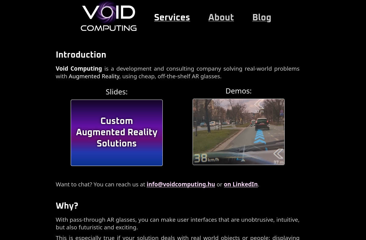
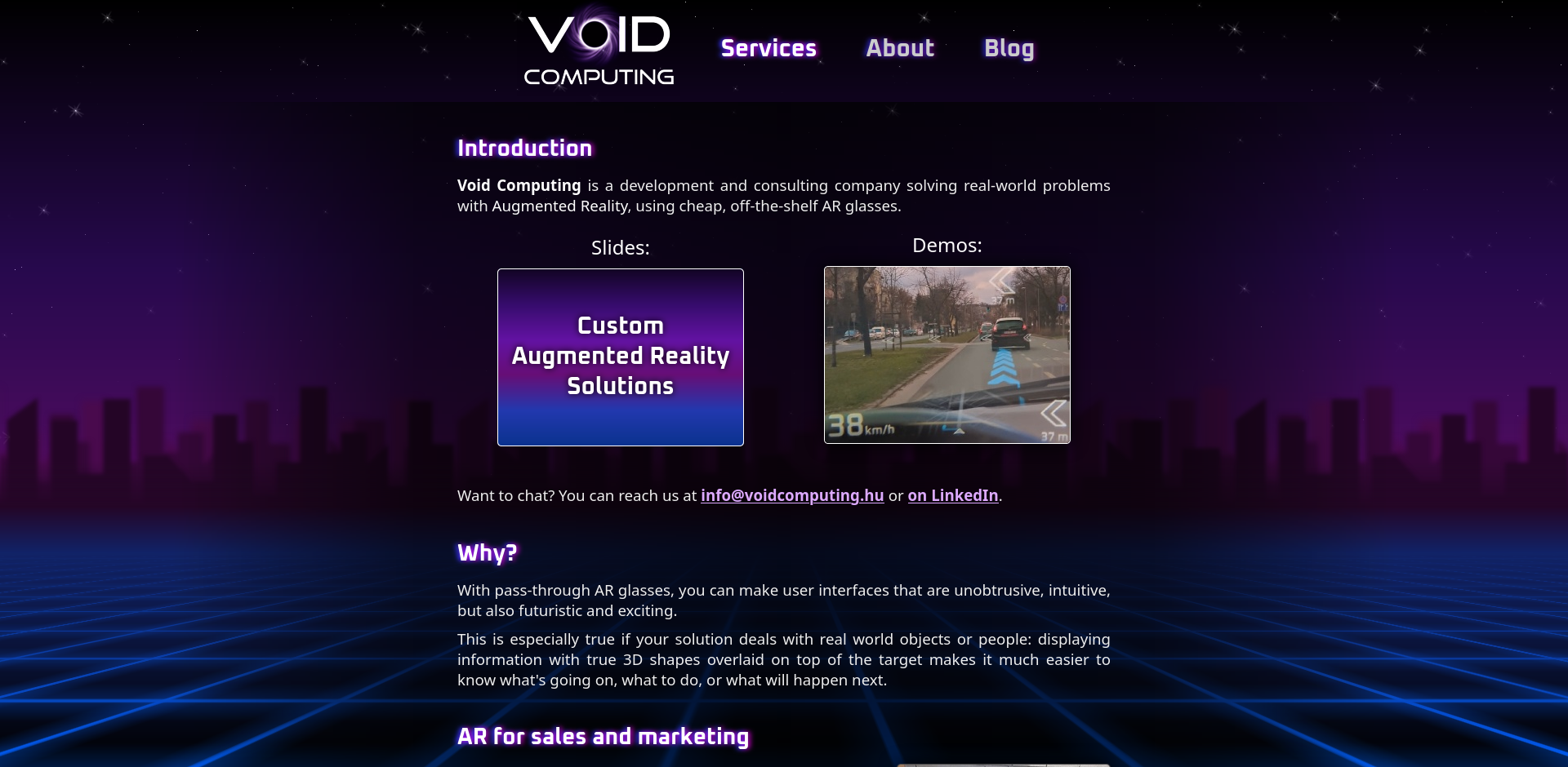
Current look
This is how the site looked before the redesign (click to zoom):
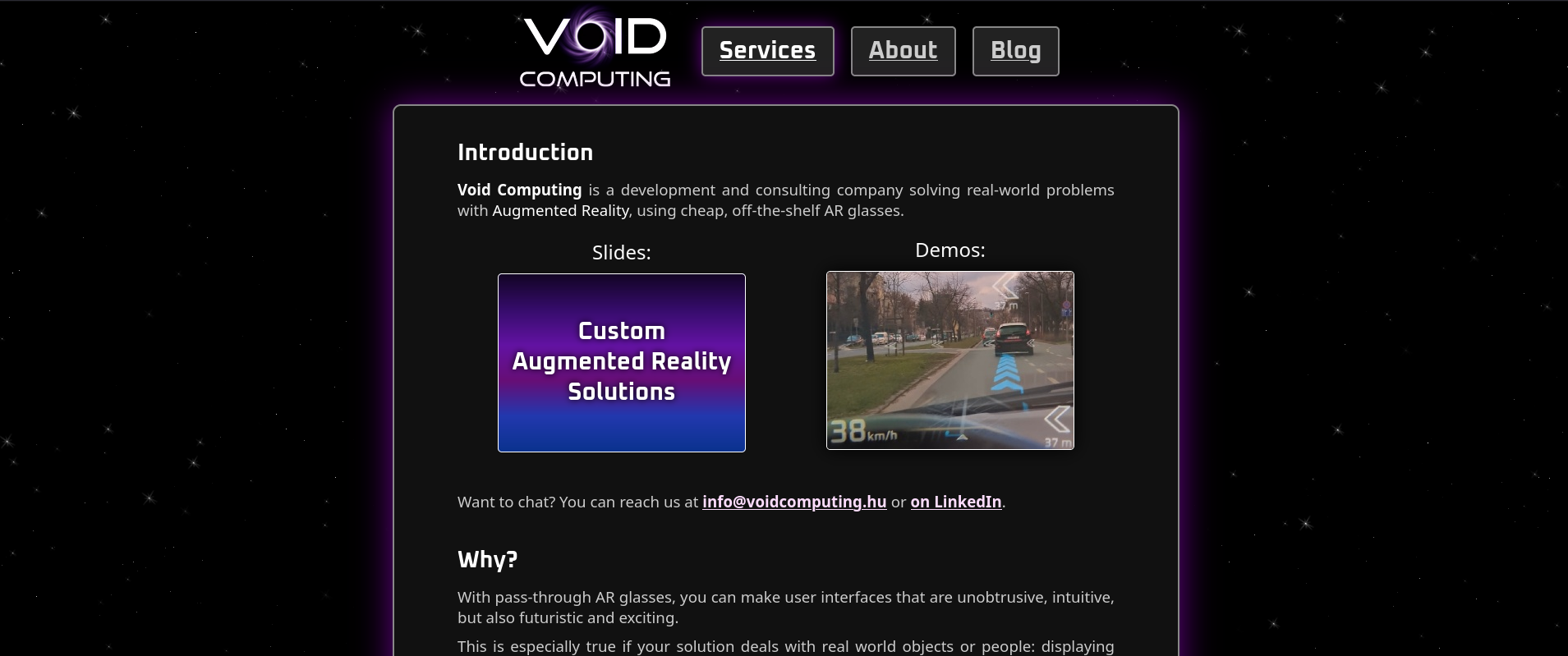
I explained in the slide deck styles article why this looks straight out of 1998: it's because the last time I did any webdesign was in 2008, and even then I only used 10 year old technologies. I haven't really kept up with the trends since then either.
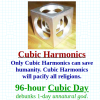
Funny side note: this "horizontally centered narrow column" style is reminiscent of some classic schizophrenic sites like Timecube and Detax Canada:

Synthwave philosophy
Now that we've established that I'm not very good at webdesign, let's jump into another topic I'm not very good at: art.
I had a realization about the whole Synthwave/cyberpunk phenomenon: while it borrows a lot from the 80s, it is also very much a product of our current culture. See the music for example: it sounds a lot like 80s disco (the "instruments", effects and melody), but it is still just a variant of EDM and Trance (especially the rythms, the basslines). It is anachronistic, but this is a good thing: we learned a lot in the last ~40 years.
So it makes sense to have modern elements and layouts on a website while not losing a retro feel.
Inspiration
I'm not a very creative person: I rarely make anything really new, but I do excel at copying and then making things better. With that in mind, let's look at a few other young retro sites, and see what we can... borrow.

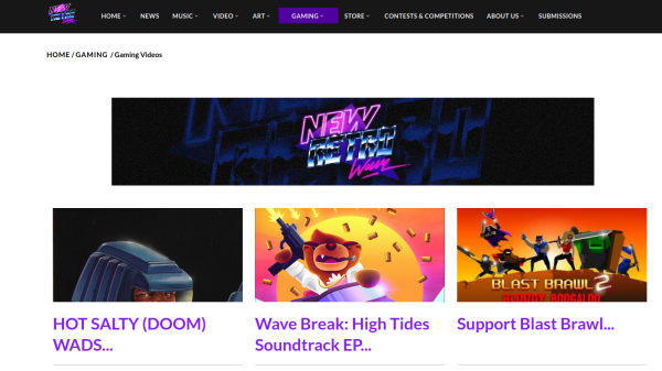
NewRetroWave
NewRetroWave is kind of a collection (or blog) of all kinds of retro electro stuff.
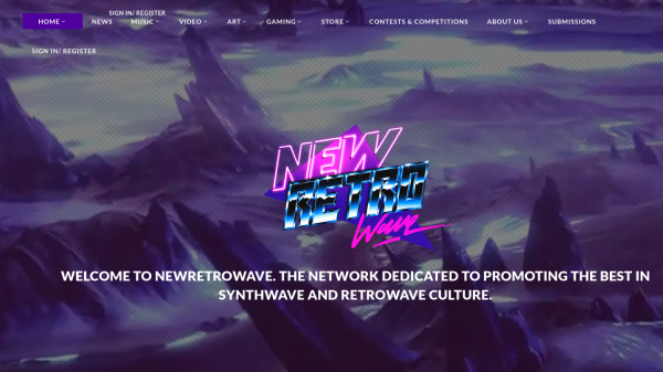
Their index page is the generic 2020s page:
- Classic bootstrap-style navbar on top
- Big horizontal sections with contrasting background changes
The rest of the pages are a generic blog with white background and purple header texts.
Retro Synthwave
Retro Synthwave is also a news site/blog about synthwave music and design.
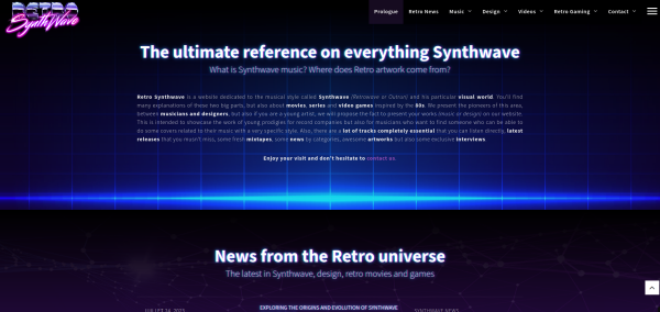
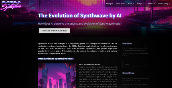
This site, again, has that characteristic modern layout, but all the visuals are very 80s. Especially this chromatic aberration text effect:

Which is done by this genius piece of CSS:
1 2 3 4 5 | |
This is going to get *yoinked* for sure.
Nightride.FM
Nightride FM is an online radio that plays sythwave music. It also has that cool winamp visualization engine implemented in JS.
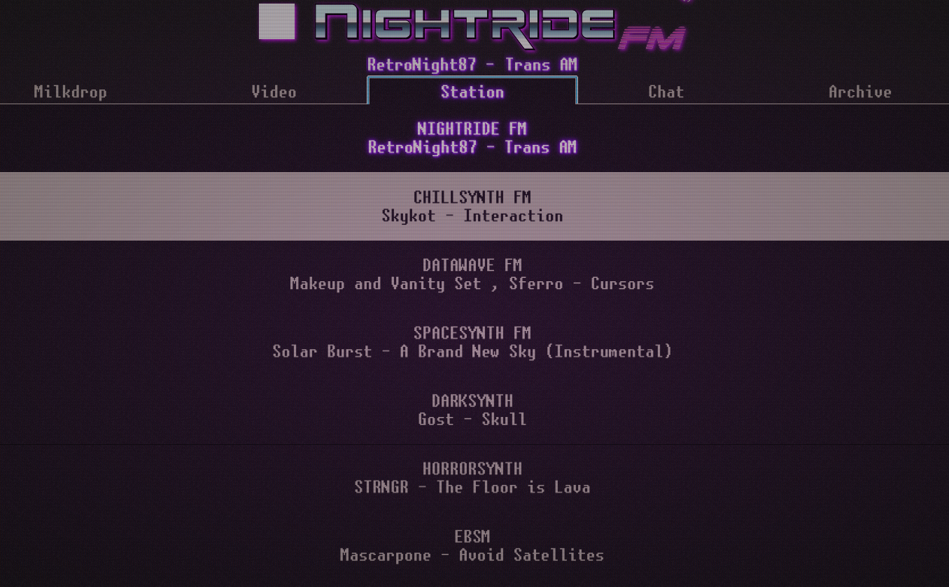
This is also a webapp, and a very simple at that, but the small styling elements and the dynamic mouse responses really make it feel polished.
Viture one
The webshop for the Viture One AR glasses was not one of the results for the synthwave search, but I'm going to include it, as it has that 2000s hacker aesthetics with the single pixel lines and fonts, and it's a good example of a retro-modern minimalist style:
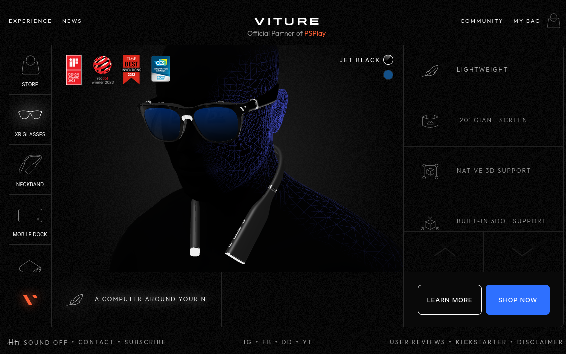
It's more of a dynamic webapp, and not a "proper" website though.
Other
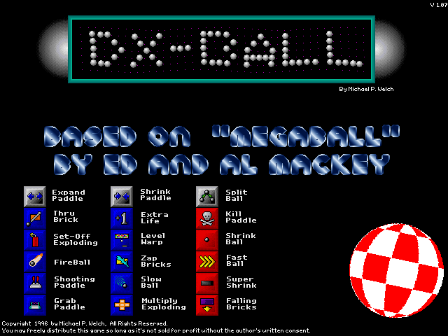
One minor reason I wanted to do a redesign is that I saw this sticker when I went to a Quixotic DJ set recently:

This was so shiny and metal, it reminded me a lot of DX-Ball, which is also a warm and fuzzy memory for me:
Problems with the current design
Based on all of the above, I can immediately see a couple of problems:
Blocks with rounded borders
While the content should stay narrow to help the reading experience, the border is visually jarring. The menu also looks cheap.
It reminds me of this classic tutorial about styling charts and tables:
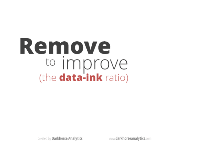
We will probably have to adopt the common modern layout.
Not enough visual styling
This seems to go against the above animgif (that less is more), but we do need more sophisticated visual effects. A simple 2 pixel border and a purple gradient looks cheap, because it is cheap. Adding more colors, distortion, noise, grids or anything along those lines help -- as long as it's handled like a spice, and the effects are in harmony with one another.
The background
The starry background would have been acceptable in the Geocities days, but nowadays you either do an interesting background, or just a solid color or very simple pattern.
Index content
This is not exactly a styling problem, but the text and structure of the index page is... nonsense, really. This is because it was done more of a fill, a placeholder, so we do have an index page. A lot of it was actually generated with LLMs. We have clearly misunderstood what our customers were thinking about Augmented Reality, and what kind of information or arguments they need.
Oh, and one of the reasons we never had proper styling is because it would've made it obvious that the content is crap. Except for the blog, of course.
Training montage
The site was revamped step by step, mostly by just editing the CSS and watching live.
Initial state:
Removing the borders and background:
Adding that sweet chromatic aberration to headings, and some other color changes:
Adding the background from the slide deck:
As a final step, improve menu with background and different layout, and shake the index up a bit:
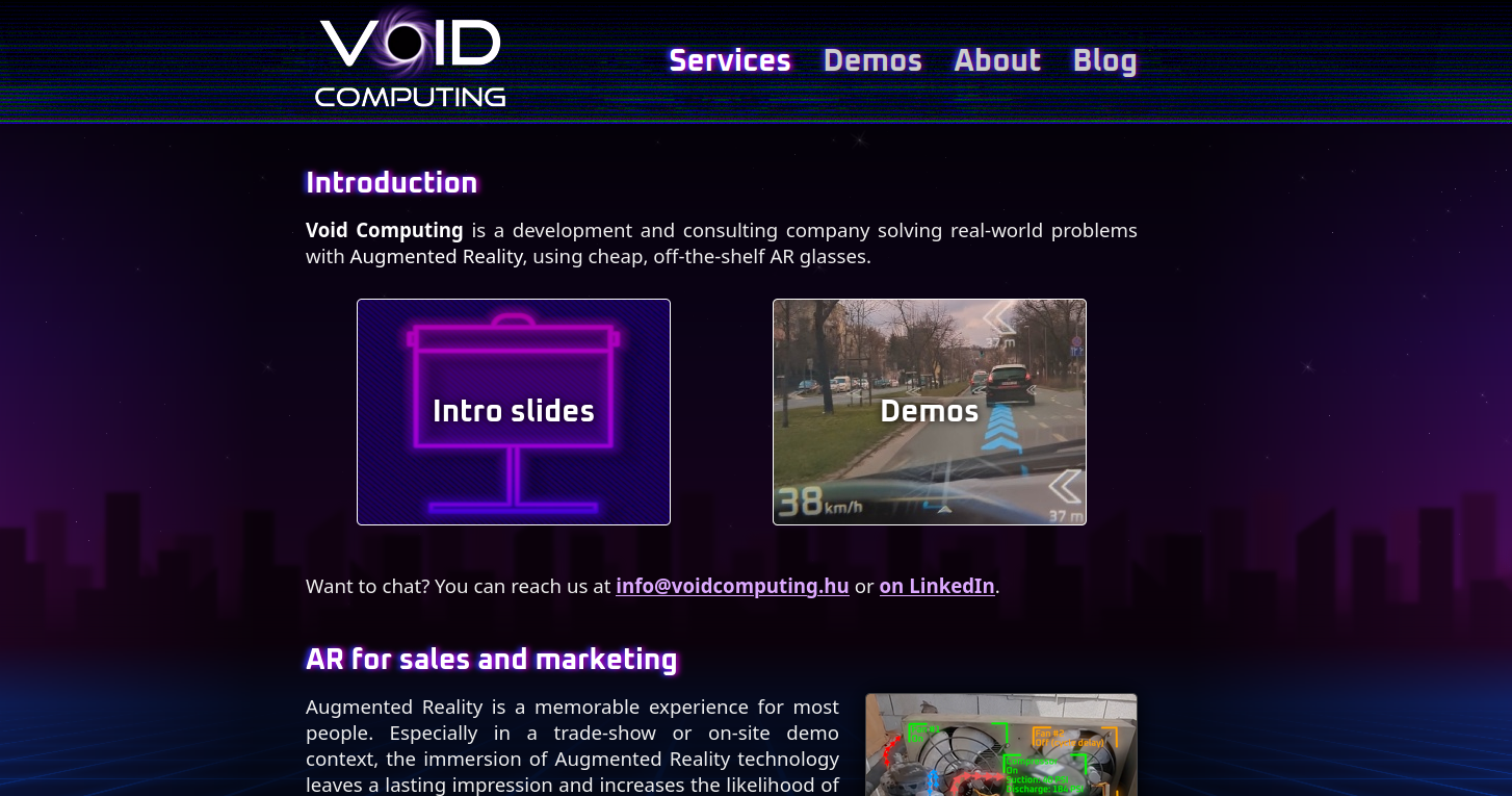
Finished design?
This is all I'm going to do for now. I think it's pretty acceptable as it is, but I'll have to pay an actual graphic designer sooner or later.
Raw UVC on Android
If you need Augmented Reality problem solving, or want help implementing an AR or VR idea, drop us a mail at info@voidcomputing.hu