Synthwave slides
One of the less fun parts of trying to run a company is having to create all kinds of marketing materials, such as product and investor slides.
I already use reveal.js for all my slideshow needs, so there's one thing that will make the job bearable:
A scrolling synthwave-style background made with HTML+CSS.
The synthwave style
As you may have noticed, the 80s are back (again), but it's called synthwave now. When this style first appeared, it spoke to me on a level I haven't felt since the 2000s. That's why this page looks the way it does, and also why all my marketing videos have synthwave background music.
Let's see what google images thinks about synthwave backgrounds:
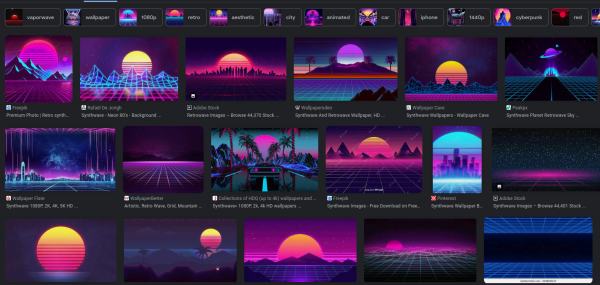
Decomposed to its key elements:
- Color scheme is exclusively blue and purple and pink (affectionately called bisexual lighting
- The tron grid at the bottom
- Either a cityscape or mountains on the horizon
- Haze-like gradients on both the sky and the grid
- That huge striped sun with unknown origin (first use I could find was a Californian license plate pattern from 1980)
Since this is going to be a background for slides, I'm going to ditch the sun and also dial back some of the gradients. A cityscape sounds easier to do right (since it's just a bunch of rectangles) than mountains, so we are going with that too. It also gives more of a cyberpunk feel instead of the distinct Californian/Nevadan desert style.
Foundations
For the rapid prototyping phase, I just made a quick html:
1 2 3 4 5 6 7 8 9 10 11 12 13 14 15 16 17 18 19 20 21 22 23 24 25 26 27 28 29 30 31 32 33 34 35 36 37 38 39 40 41 42 43 44 45 46 47 48 | |
Please don't judge me too harshly. While I did some HTML and CSS was back in 2007 for Stickman Warfare (archive site), but I outsourced that to much more capable people as quickly as I could. I also did some CSS work for AJDB, and of course this site, but I'm in no way a frontend guy.
Consider this a "for fun" thing than a best practices guide. At least I can center a div though :D
Anyway, the above html looks like this:
The grid
We can now experiment with a background div and its corresponding css.
Looking through some cute code, the chic way of making grids is gradients
and background-size magic to make it repeat. Let's give it a try.
First off, let's make a test-div inside the background div:
1 2 3 4 5 6 7 8 9 10 11 12 13 14 15 16 17 18 19 20 21 22 23 24 25 26 | |
As you can see, we can use gradients to draw a line, and we can also use multiple gradients to compose the background. We can later modify this gradient to have an even softer glow around the lines too, but let's do that in the finishing steps.
This gives us a single grid unit:
It's more of a cross I guess. But this is where a
somewhat disgusting magic comes into play: the background-size CSS
property.
1 2 3 4 | |
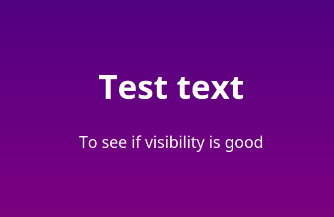
This sets the size of the background "image" (generated by the gradients), and the auto-repeat does the rest:
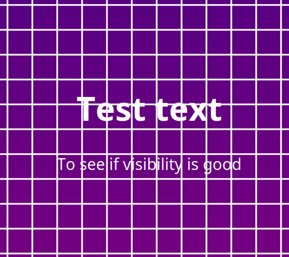
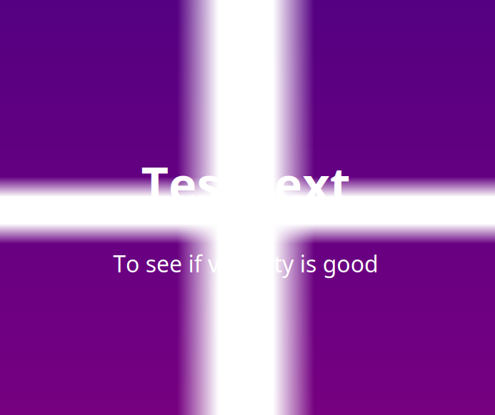
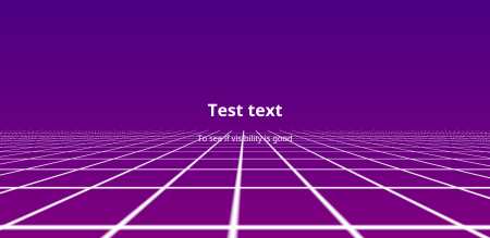
Visibility is not that good, eh? We are on it.
3d-ifying the grid
Apparently there are 3d transforms in CSS now. And this is what we are going to do to our grid.
For this to work, we need to create a container div with the perspective
property. This is going to be our viewport for the perspective transformations,
basically. We need the grid to be in the lower half of the screen, with
the vanishing point of the perspective being the top of this div:
1 2 3 4 5 6 7 8 9 10 11 12 13 14 15 16 17 18 | |
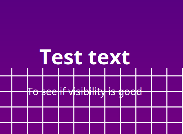
At this point, nothing happens yet, because the grid itself is not transformed at all:
But once we do transform it, the magic finally happens:
1 2 3 4 | |
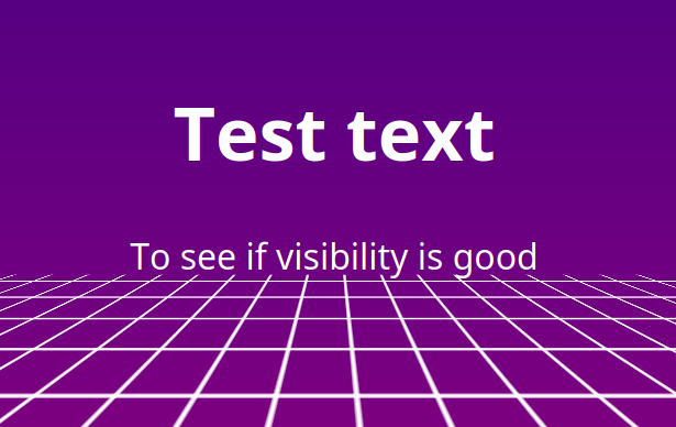
We are getting somewhere, but as you can see, we are running out of grid. This is because the size of our grid is finite, and transformation is done after it got "rendered". We just have to adjust our transformations a bit:
1 2 3 4 5 6 7 8 | |
BTW, all those percentages create a "responsive" grid, for better or worse:
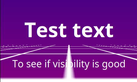
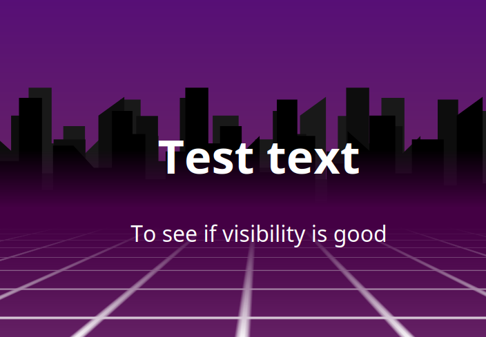
Now we just have to make it vanish on the horizon, since it starts to look pretty pixelated towards the center (due to the lack of mipmapping and anisotropic filtering that we usually have in proper 3D).
We will use one of the oldest 3D tricks in the book: distance fog. We also adjust the global background gradient a bit for now:
1 2 3 4 5 6 7 8 9 10 11 12 13 14 15 16 17 18 19 20 21 22 23 24 25 26 27 | |

I love how every color is a synthwave color as long as it doesn't contain too much green.
Cityscape
Next on our list is some buildings on the horizon.
To be honest, first I wanted to create a python or js script
to generate a bunch of rectangles, but this seemed more and
more pointless and inelegant the more I thought about it.
Also I've been using Inkscape lately, and I kind of love it, so I decided to just make a city horizon SVG. It's still a bunch of rectangles, but it's 𝓪𝓻𝓽𝓲𝓼𝓪𝓷𝓪𝓵 now.

It is bright purple on transparent, so we can more easily colorize it
with the fancy filter: brightness(...) CSS property. The reason
for this is that I want multiple layers of this stuff so it looks
extra 3d.
After this bit of manual CSS-ing:
1 2 3 4 5 6 7 8 9 10 11 12 13 14 15 16 17 18 19 20 21 22 23 24 25 26 27 28 29 30 31 | |
We get this image straight out of a Microsoft Excel 97 template:
Finishing touches
Since this is going to be used in a somewhat serious manner, the colors, gradients and such need to be tweaked a bit so it harmonizes more, and also doesn't clash with the foreground, because let us not forget, this is a background, not the star of the presentation.
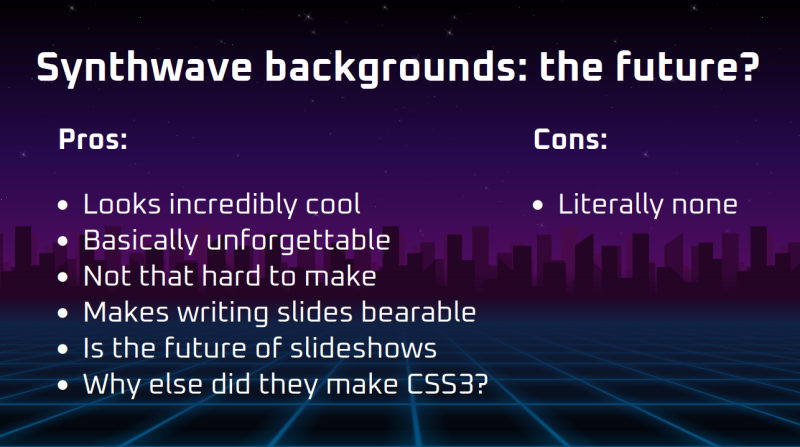
The final result can be downloaded as html. Licence is CC BY 4.0.
Integrating into reveal.js
Reveal.js has its own system for backgrounds: it creates a background
div for each slide, and then transitions between them. This works
great if you have different backgrounds for different slides, especially
if some of them are GIFs or videos, but for our purposes it's actually
overkill.
Thankfully, we don't need to use this system, we can just directly insert our divs into the HTML, and it will render correctly. This of course breaks PDF export, but that's pretty janky anyway, and can be done another day.
So what I did was just copy-paste the CSS part into the theme CSS, copy-paste the background div before the reveal div, and it worked out of the box.
One last step to do was to subscribe to the slide change event, and do some background offset magic.
1 2 3 4 5 6 7 8 9 10 11 12 13 14 15 16 | |
One last-last step to do is set transition: background-position-x 400ms;
on all affected classes.
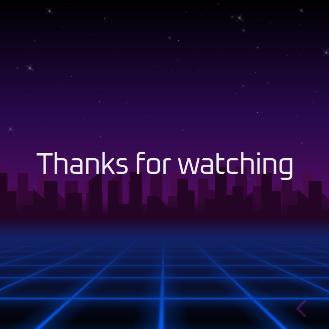
The end result is quite pretty if I say so myself:
If this doesn't convince investors and customers that we are
incredibly high tier, nothing will.
Rally pace note generation
Reverse engineering an unknown CRC
If you need Augmented Reality problem solving, or want help implementing an AR or VR idea, drop us a mail at info@voidcomputing.hu